How To Optimize Website For Mobile CSS The Right Way
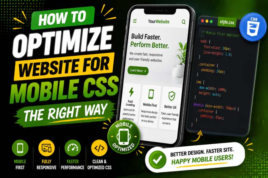
How to optimize website for mobile CSS starts with one goal: make your page easy to read, tap, scroll, and use on any phone. The right CSS ensures each section fits the screen, loads quickly, and guides visitors toward the next useful action.
When your layout supports real mobile behavior, users stay longer because they do not need to pinch, zoom, or fight the page. This guide will help you understand a simple strategy for optimizing website for mobile CSS. Read on!
Start with the viewport tag because mobile browsers need clear scaling rules. Add <meta name=”viewport” content=”width=device-width, initial-scale=1.0″>, then write CSS for the smallest useful screen before you expand the layout. In May 2026, mobile accounted for 51.04% of the worldwide desktop-versus-mobile platform share, so your mobile version now reaches a major part of your audience.
Image idea: Bar chart showing mobile at 51.04% and desktop at 48.96%.
Your base design should stack content, keep buttons easy to tap, and prevent horizontal scrolling. A clean theme setup also matters, as heavy templates can add clutter. A tool that helps you build top sites in record time with premium themes can support faster builds while keeping the layout light. Treat every section as a mobile block first, then add columns only when the screen has enough room.
Expert Tip: Build for the smallest practical screen first, then add space, columns, and visual details as the viewport grows.
Mobile-first CSS means your default styles apply on phones, and larger screens get upgrades via min-width media queries. In the first quarter of 2026, mobile devices accounted for 52.27% of global website traffic, so this approach matches how many people browse. Your first layout should be simple, readable, and useful before you add wider-screen styling.
Image idea: Line graph showing mobile traffic above half of global website visits.
Use box-sizing: border-box, fluid widths, comfortable line height, and padding that keeps text away from screen edges. Your CSS should let content shrink, wrap, and breathe without needing a patch for every phone model. This foundation gives you fewer layout bugs and a smoother editing process.
A media query should fix a content problem, not chase a device name. Start with one column, move to two columns when cards have room, and use three columns only when the layout still feels readable. This keeps your design practical because the screen width adapts to the content’s needs.
Responsive issues often stem from desktop assumptions, so a practical resource on how to make a website mobile-responsive addresses the same problem users face when a page needs to resize, stack, and stay usable. The core idea is simple: the layout should not require zooming, pinching, or horizontal dragging. Place media queries after base styles so they override cleanly.
Expert Tip: Use fewer breakpoints with a clear purpose, as too many can create more mobile bugs.
Images often create both layout problems and speed problems on mobile. Set image containers properly, keep image files small, and avoid serving large desktop visuals to small screens. Then use modern formats like WebP or AVIF when your site supports them.
A mobile page can look fine but still struggle if search engines cannot crawl or render the important content, so a guide on why a WordPress site is not showing up on Google Connects mobile rendering with search visibility. Keep essential text in HTML and confirm that mobile carries the same core information as the desktop. In 2024, global retail mobile commerce was expected to reach nearly $4.5 trillion and make up 69.9% of retail ecommerce sales, so image speed can directly affect revenue.
Mobile typography should be readable without zoom. Start body text around 16px, use a comfortable line height, and avoid dense paragraphs that fill the whole screen. Your visitor should be able to understand the page without rotating the phone or zooming in on every paragraph.
Spacing needs the same care as text. Give buttons enough tap area, separate links so users do not tap the wrong item, and keep forms easy to complete with one thumb. Avoid fixed-height sections because real content often needs more room on phones.
The fastest mobile improvement is often removing what users do not need. Cut sliders that push content down, sidebars that become noisy blocks, and decorative images that slow the first screen. A cleaner layout helps the user focus on the main action.
In 2024, INP replaced FID as a Core Web Vital for responsiveness, which means modern performance work looks beyond the first click. Heavy popups, slow menus, and script-heavy widgets can make a page feel broken after the user taps. Keep the interface calm.
When refining layout simplicity, it also helps to test how different visual text styles behave inside compact mobile sections. For example, tools like WeirdTextGen can be used to preview how styled or unusual text appears in tight responsive blocks before finalizing your CSS decisions.
Image idea: Before-and-after mobile layout showing clutter reduced to one clear column.
Layout stability means the page does not jump while it loads. Set image dimensions, reserve space for embeds, and avoid banners that suddenly push content down. Google’s good CLS target is 0.1 or less, so stable mobile design protects both usability and performance quality.
Image idea: Gauge showing CLS below 0.1 as the safe zone.
Use aspect-ratio for cards, thumbnails, and video boxes when the final media size is predictable. For example, aspect-ratio: 16 / 9; lets the browser hold space before the image loads. This prevents accidental taps during loading.
Clean CSS helps mobile devices render faster. Remove unused rules, minify production files, and avoid loading a large framework when the page uses only a few pieces. Smaller files help the browser show the page sooner.
A specialist like Law Firm SEO Company can help improve mobile-ready SEO structure for law firm websites.
Google’s good LCP target is within 2.5 seconds from when the page starts loading. LCP often depends on the hero image, main heading, server response, CSS blocking, and font loading. Focus on the first visible screen because users judge speed before they scroll.
Image idea: Stopwatch graphic showing LCP at 2.5 seconds or less.
Relative units help your layout adapt to different screens. Use percentages for flexible widths, rem for scalable text, and fr units for grid tracks. These units help your design stay flexible across phones, tablets, laptops, and wide monitors.
A flexible grid can use grid-template-columns: repeat(auto-fit, minmax(240px, 1fr)); to wrap cards naturally. INP should be 200 milliseconds or less for good responsiveness, so keep menus, filters, tabs, and accordions light. If CSS can handle a layout behavior without heavy scripts, use CSS.
Do not rely only on a desktop browser dragged to a smaller. Use a real phone, browser device tools, PageSpeed Insights, and Search Console when available. PageSpeed Insights reports lab and field data, and field data uses the previous 28-day period when sufficient real-user data is available.
Test the homepage, blog posts, product pages, forms, and checkout pages. Check that menus open smoothly, forms fit the screen, images stay inside containers, and buttons remain easy to tap. Also, test orientation changes, as some users switch between portrait and landscape while reading, watching, or filling out forms.
User experience perception can also be influenced by how platforms evolve their interaction signals over time, including changes like YouTube dislikes, which reflects how interface feedback systems can affect user trust and behavior.
A flexible layout should not collapse when the phone rotates. Keep enough spacing around inputs, labels, and buttons so the page still feels stable. This simple test often reveals problems that desktop resizing misses.
A checklist helps you repeat good mobile work. Start with viewport settings, mobile-first base styles, flexible images, readable text, safe tap targets, and content-based breakpoints. This keeps your process clear when you update old pages or build new templates.
Google uses the 75th percentile for Core Web Vitals field assessment, so slower user experiences still count. You cannot test only on a fast laptop and call the page optimized. Your mobile CSS must serve real users on different phones and networks.
Image idea: Checklist card with viewport, images, fonts, CSS, JavaScript, and Core Web Vitals.
A good checklist also protects future updates. When you add a plugin, banner, font, or new section, run the same mobile checks again before publishing. Small changes can break narrow screens, so repeat the process every time the design changes.
Do not treat responsive design as a quick media query patch. Start with content priority, then let CSS support that order. A mobile page should show the most useful content first, not simply squeeze the desktop page into one column.
Do not hide important desktop content on mobile just to make the page shorter. You can collapse secondary details, simplify visuals, and reorder sections, but users should still get the same main value. Avoid sticky headers, stacked popups, and chat widgets that cover the screen.
How to optimize website for mobile CSS means building a page that respects small screens, slow networks, and impatient users. Start with the viewport tag, write mobile-first CSS, use flexible images, create content-based breakpoints, and remove anything that slows reading or loading. Then test the actual mobile experience rather than relying on a desktop preview.
A strong mobile page stays readable, stable, fast, and easy to tap from the first screen to the final action. When your CSS supports those goals, your website provides visitors with a smoother experience and search engines with a cleaner page to understand.
Start with the viewport tag. Use flexible widths, responsive images, readable fonts, and content-based media queries.
Use rem, percentages, and Grid fr units for flexible layouts. Avoid fixed widths for major page sections.
Most websites need two or three strong breakpoints. Add another only when content becomes cramped or broken.
Hide only decorative or secondary items. Keep main content and calls to action available.
Inspect fixed widths, wide tables, oversized images, and 100vw sections. Then set flexible widths and test again.
Yes, media queries still help you adjust layouts at important screen widths. Flexbox and Grid reduce how many you need.
Use max-width: 100%; height: auto; for normal images. Add srcset, sizes, lazy loading, and modern formats.
Yes, mobile CSS affects usability, rendering, speed, and layout stability. These signals support users and search performance.
A 16px body font is a strong starting point. Pair it with clear contrast and enough spacing.
Use a real phone, browser device tools, PageSpeed Insights, and Search Console. Test more than the homepage.
Mobile-first is usually better because it starts with the simplest layout. Add wider layouts as the screen grows.
Large images, render-blocking CSS, heavy JavaScript, too many fonts, slow hosting, and third-party scripts often slow mobile pages. Fix the first screen first.
Build stunning portfolios and agency websites with a modern, flexible, and fully customizable WordPress theme powered by Elementor.